Ling
A language learning app in need of a refresh
Brief
Rebuild Ling’s design system. Add re-styled base components, icons, and base colors to design system, and rebuild 95% of all screens based on the new design system.
Time
Three+ months
Team
2 product designers (design lead and me)
Deliverable
A complete design system, including components, icons, color and typography components, and high-fidelity screens
Role
Mid-level product designer, UX writer
The company | Ling
Ling is a language learning app focused on making hard-to-teach languages feel accessible—from Thai to Serbian to Korean. With over 60 languages and a playful tone, they combine structure, native audio, and just enough gamification to keep things engaging.
The challenge: with a fast-growing client base (and team) Ling’s design files had grown unwieldy. We needed a way to build consistency and collaboration across every-growing teams.

The problem | growing pains
Going from one to three designers who support a growing development team, we needed to reduce repeated design decisions, minimize inconsistencies, and make it easier for both designers and developers to move fast without breaking code or designs. Our original Figma files lacked shared styles and components, and the component library we did have wasn’t following the most current design system best practices.
our approach | a systems Mindset


Audit and assess
starting with an audit of all screens across our mobile app to identify visual inconsistencies, duplicate flows, and outdated components.
Gain: We mapped shared patterns and pain points across the team.
The foundations
We created the base elements: typography styles, color and spacing tokens, icon sets, and a foundational naming convention for future maintainability.
Gain: an atomic system with reusable molecules that allow us to easily build future features.
Layout rebuild
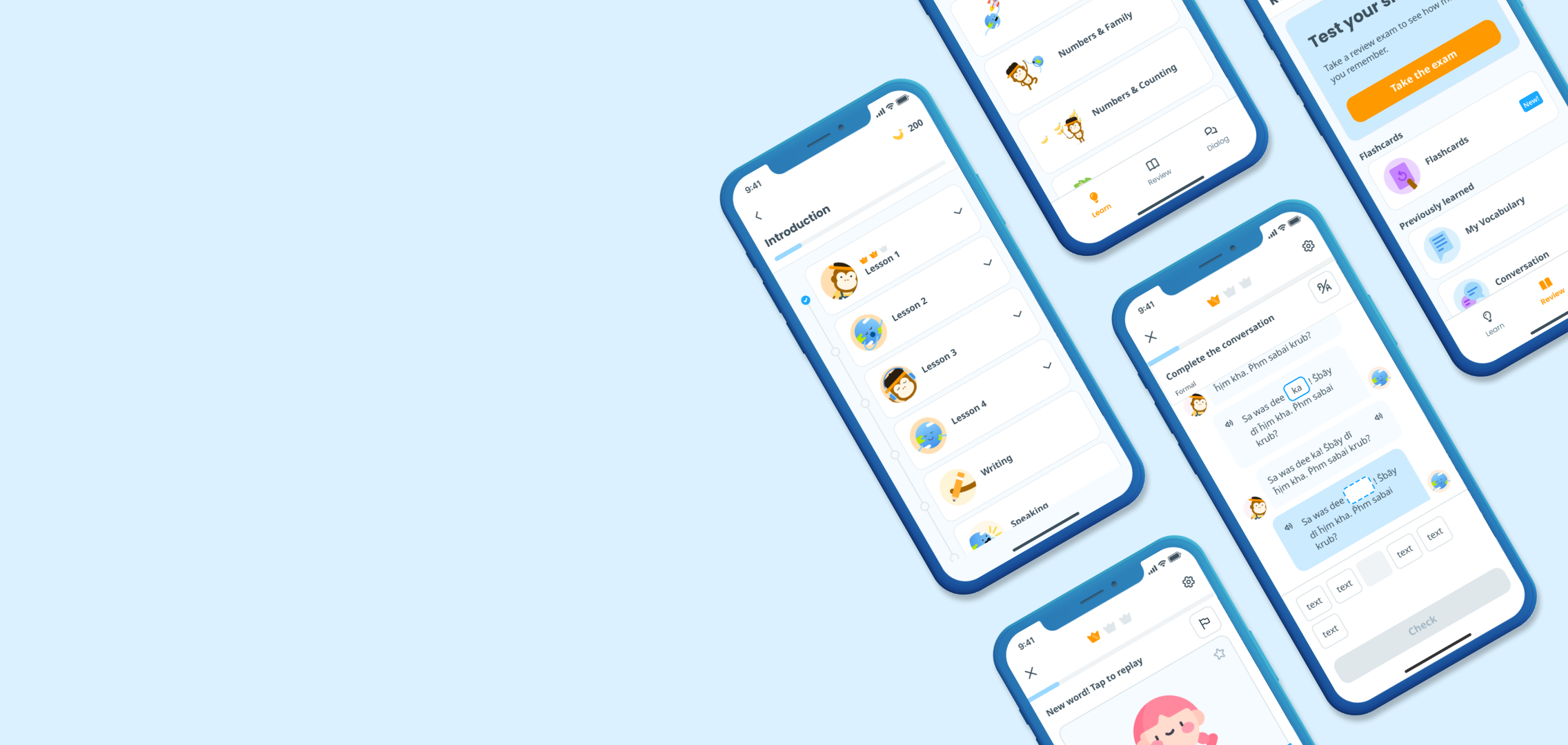
We rebuilt our primary screens using the new system, starting with high-impact areas like onboarding and the Learn tab.
Gain: we rebuilt 95% of screens by the launch date, aligning almost every user flow with system components.
Collaboration and documentation
Our design team worked closely with engineers to ensure handoff was frictionless.
Gain: we annotated specs, created a shared dev-design Figma space, and documented rules for component usage, tokens, and screen behavior.
Team integration
Our design team introduced the system gradually across teams through (async) walkthroughs and Clickup documentation.
Gain: we empowered others to design and develop faster, with clarity and confidence.
The outcome | Scalable success
The design system improved design-dev velocity, reduced inconsistencies across platforms, and created a shared language for our team. It also enabled easier onboarding of new team members and helped us scale designs for future growth. It laid the groundwork for improved onboarding, gamification, and rewards features in subsequent quarters.
takeaways | design
Design systems aren’t just UI kits—they’re about clarity, trust, and repeatability.
A system only works if it’s adopted. We focused on usability, not perfection.
Designing with devs in mind from the start made implementation smoother and avoided rework.
The project marked a shift in how Ling approached product development—with shared foundations that support speed, quality, and user experience at scale.
Thank you for reading!
Email me at meghoffman.ux@gmail.com if you want to work together, or just to grab a coffee. I’d love to hear what you think!